Sherwin-Williams Snowbound (SW 7004) has become one of the most discussed paint colors in the interior design world over the past several years, and for good reason. It occupies a unique position in the white spectrum — warm enough to feel inviting, light enough to feel airy, and complex enough to avoid the flatness that plagues many popular whites.
But is it the right choice for a Florida home? The answer, as with most paint color questions, depends on your specific space, your light conditions, and what you are trying to achieve.
What Makes Snowbound Different
Snowbound is classified as a white, but it has a subtle gray-green undertone that becomes more visible in certain light conditions. This undertone is what gives it its complexity — it does not read as simply white, but as a white with depth and character. In north-facing rooms with cool light, this undertone can become more pronounced and push toward a slightly gray appearance. In south or west-facing rooms with warm Florida light, it tends to read as a clean, soft white with just enough warmth to feel comfortable.
Where Snowbound Works Beautifully in Florida Homes
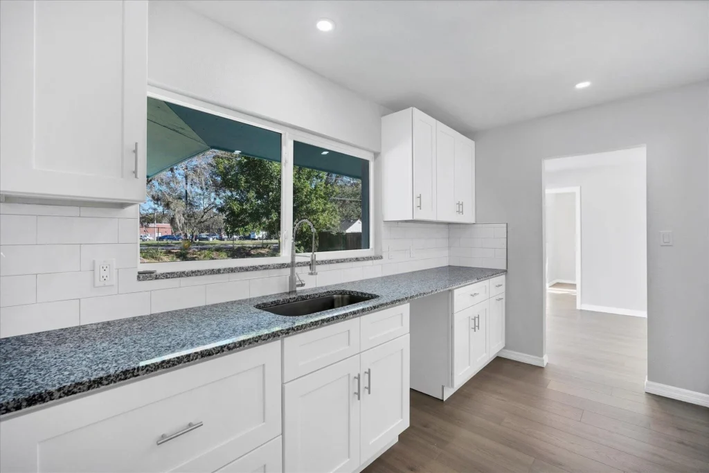
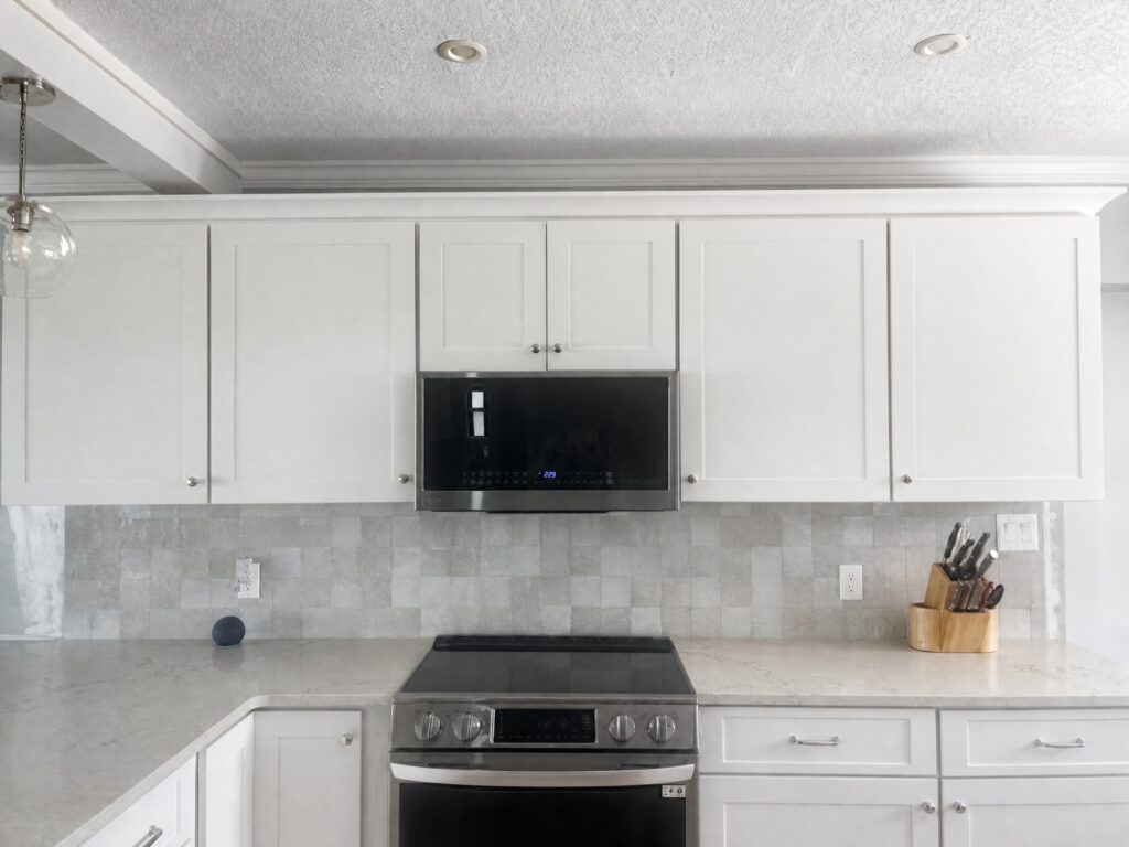
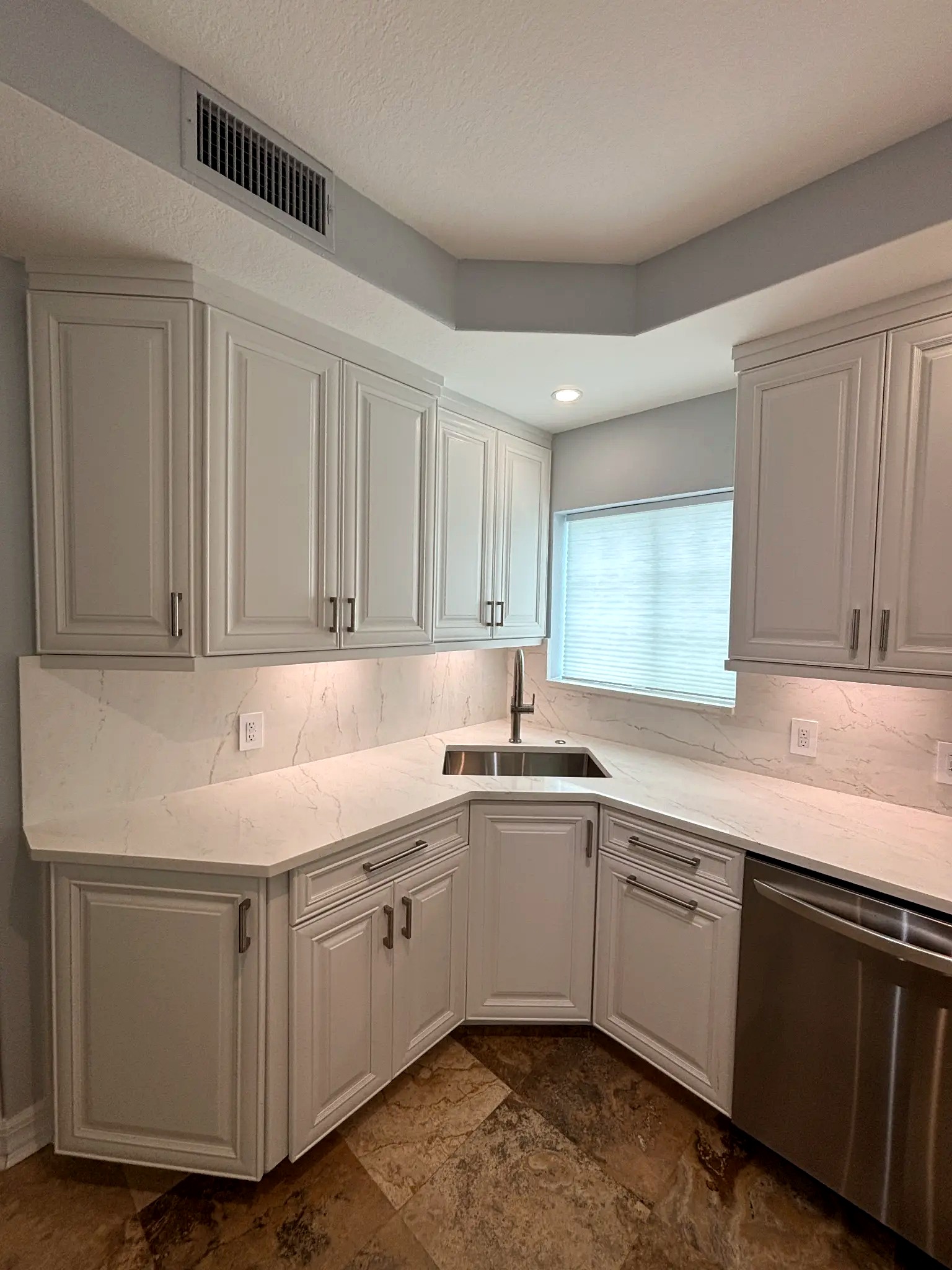
Snowbound performs exceptionally well in open-plan living spaces where it is used consistently across walls, trim, and ceiling. This monochromatic approach allows the color’s subtle complexity to read as sophisticated rather than indecisive. It also works beautifully in kitchens, particularly when paired with warm wood tones, natural stone, and brass or unlacquered bronze hardware.
In bathrooms, Snowbound creates a spa-like quality that many homeowners find appealing — it is clean without being clinical, and it pairs well with both cool marble and warm travertine tile.
Where to Be Careful
In rooms with significant north-facing exposure or heavy shade from mature trees, Snowbound’s gray-green undertone can become more dominant than intended. If you are working with a room that has limited natural light, we recommend testing Snowbound alongside Alabaster (SW 7008) and Creamy (SW 7012) to see which reads most warmly in your specific conditions.
Our painting team at Bayshore Remodels provides physical sample applications so you can evaluate any color in your actual space before committing. Contact us to schedule a color consultation for your home.
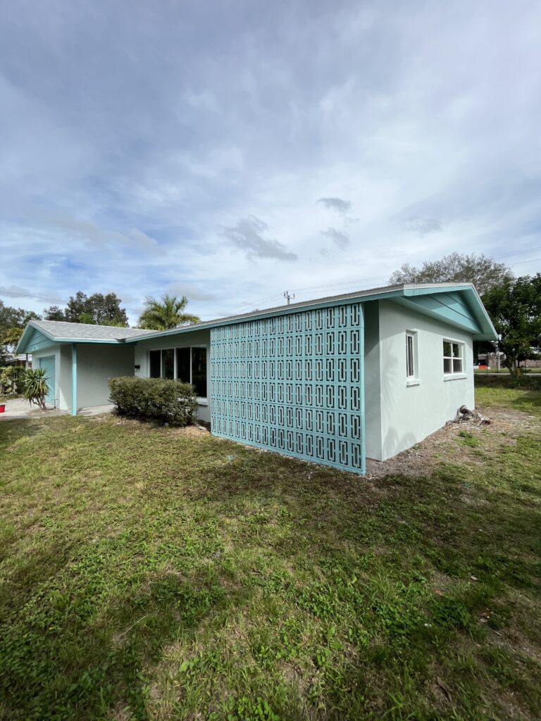
Featured image: AI-generated illustration. © Bayshore Remodels 2026.
Continue Planning Your Project
For more practical guidance, visit our All Services service page and explore related Design Tips: