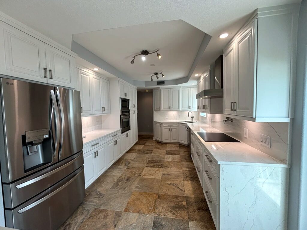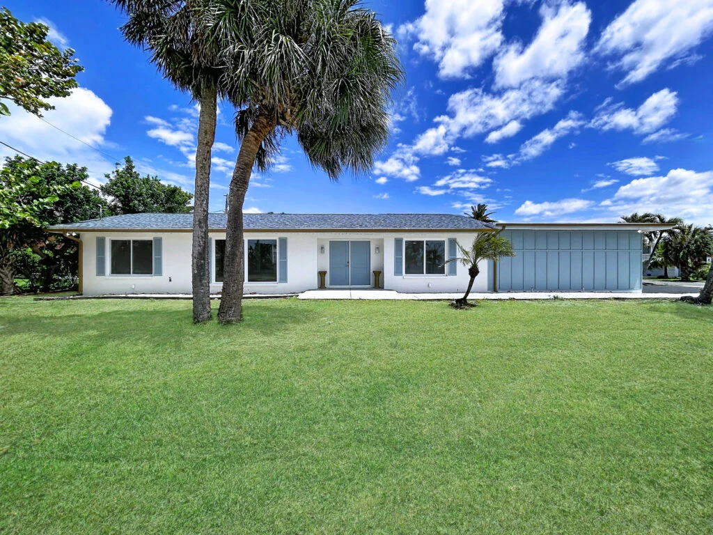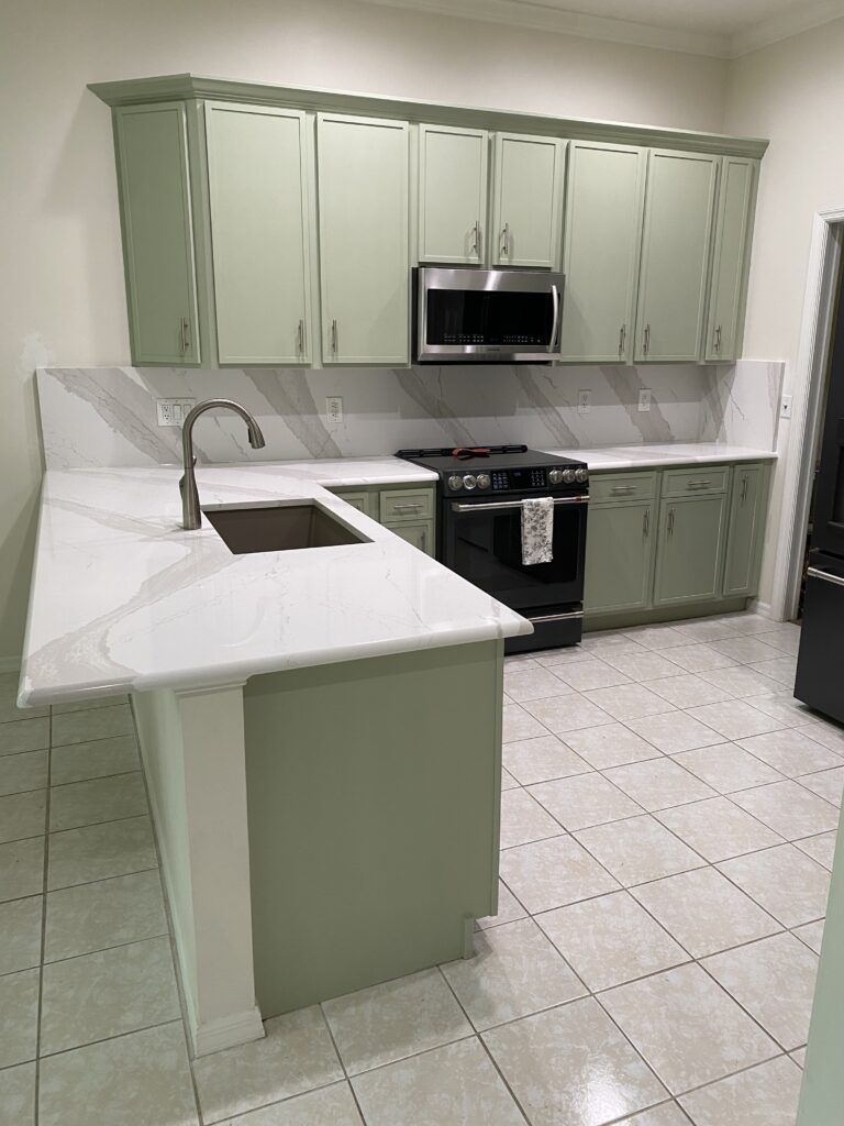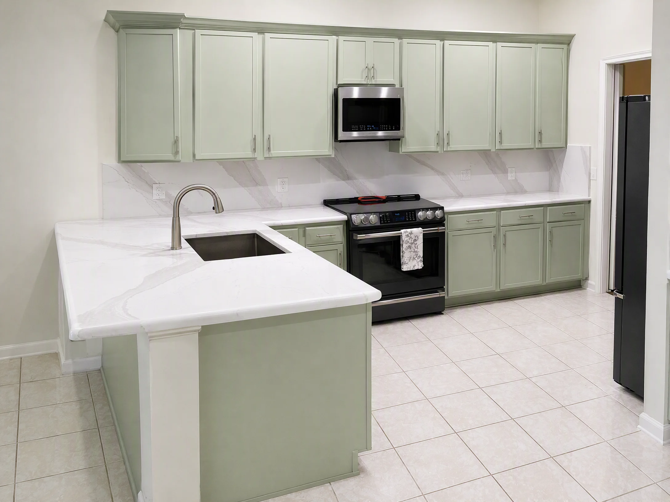

When it comes to giving your home a fresh and modern look, the right color choice can make all the difference. Our team at Bayshore loves to show off the impact the perfect color can make, and we’re excited to dive into three popular blue-green shades from Sherwin Williams:
What Tampa Bay Homeowners Should Know
Sea Salt – SW 6024
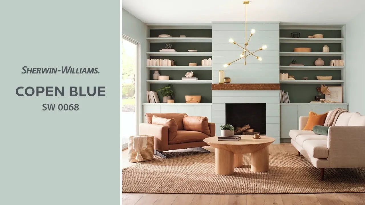
Copen Blue – SW 0068
What It Costs With BayshoreInterior painting with Bayshore runs $4–$5 per square foot of home for walls, ceilings and trim. Painting a typical 1,500–2,000 sq ft home inside and out runs $14,000–$22,000. Every paint job carries a 2-year warranty against blistering and peeling and a 30-day touch-up visit.
Typical ranges from our recent projects. Your written estimate, built after we see your space, is what your project is priced on.
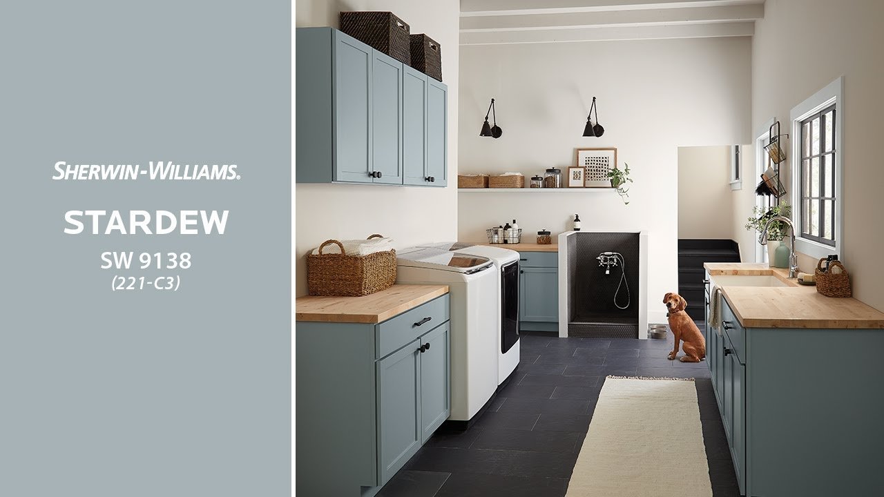
Stardew – SW 9138
Let’s compare these beautiful hues and explore how to best use them in your home.
Sea Salt: A Soothing Choice for a Serene Space
Sea Salt is a versatile and calming blue-green shade that brings the tranquility of the seaside into your home. Its light and airy feel make it an excellent choice for bathrooms and bedrooms, creating a spa-like atmosphere that’s perfect for relaxation. Sea Salt pairs beautifully with soft neutrals like creams and light grays, providing a subtle, soothing backdrop.
In a bedroom, Sea Salt works wonders when combined with crisp white linens and natural textures. For bathrooms, consider pairing it with marble countertops or white cabinetry for a clean and refreshing look.
Complementary colors from Sherwin Williams include Alabaster (SW 7008) for a crisp contrast or Comfort Gray (SW 6205) for a deeper oceanic feel.

Copen Blue: The Perfect Hue for a Welcoming Space
Copen Blue is a vibrant blue-green that exudes a sense of warmth and welcome. Its cheerful yet soft tones make it ideal for living rooms and kitchens, where it can create a cozy and inviting atmosphere. This color pairs wonderfully with rich wooden furniture and golden accents, adding a touch of brightness and energy to communal spaces.
In the living room, Copen Blue on the walls, complemented by dark wood furniture and gold or brass fixtures, creates a sophisticated yet homely feel. In the kitchen, pair it with wooden cabinets and natural stone countertops for a rustic, yet refined look.
Complementary colors include Accessible Beige (SW 7036) for a warm contrast or Naval (SW 6244) for a vivid, nautical vibe.
Stardew: A Fresh Take for Modern Spaces
Stardew, with its contemporary and fresh appeal, is perfect for modern homes looking to add a touch of sophistication. This muted blue-green shade is ideal for living areas and home offices, providing a calming yet focused ambiance. It pairs well with minimalist décor, metallic accents, and sleek furniture, making it a great choice for a modern aesthetic.
In a living area, Stardew walls can be complemented by furniture in shades of gray or black for a more modern look. For a home office, pair Stardew with white or light wooden furniture for a clean, focused environment.
Complementary colors include Pure White (SW 7005) for a sharp, modern contrast or Peppercorn (SW 7674) for a more dramatic effect.
More Colors to Consider > Bayshore Favorites
Room-by-Room: Making the Most of These Hues
When choosing where to apply these colors, consider the mood and functionality of each room. Sea Salt is ideal for creating a relaxing retreat in bedrooms and bathrooms. Copen Blue adds warmth and cheer to living rooms and kitchens, making these spaces more welcoming. Stardew, being more muted and modern, is perfect for living areas and home offices where a balance of calm and focus is needed.
Complementing Your Color Choices
To complement these blue-green shades, consider shades that harmonize well with your chosen hue. Neutral tones like creams and grays work well with all three of these blue-greens, providing balance and allowing the shades to stand out. For a bolder look, pair them with something with more contrast like deep blues or warm beiges.
Bringing It All Together with Bayshore Remodels
Choosing the right color is just the beginning. At Bayshore Remodels, we help bring your vision to life, ensuring that every element of your space works harmoniously with your chosen color palette. Whether you’re looking for a tranquil retreat or a vibrant, energetic space, our expertise in color and design will help you create a home that truly reflects your style and needs.
Ready to transform your space? Give us a call today!
Photo Credit: Sherwin-Williams
Continue Planning Your Project
For more practical guidance, visit our services page and explore related articles in our Learning Center:
Thinking about this for your own cabinets? Refinishing with us starts at $5,000. Here’s how we do it and what it costs, or book a free consultation and I’ll tell you straight whether it’s the right fit.